
In joining Provet Cloud and stepping up to lead its Product organization, I have the privilege of leading our efforts to consistently improve our software.
Though Provet Cloud is powerful and well-liked, we know there’s always room for improvement and are dedicated to making our software the best it can be. That’s why, throughout the year ahead, we’ll be implementing significant improvements to the software, with a focus on enhancing its overall design and user experience.
Toward a cleaner, friendlier user interface
One area we’re focusing on deeply: the overall design of the user interface in order to make it more usable. We’re working on refining every aspect – every pixel – of the UI to ensure that you’re able to carry out your work and provide the best care possible without confusion and unnecessary hassle.
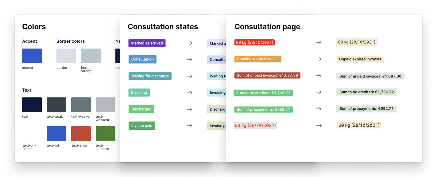
A major portion of these improvements will come from implementation of the Nord Design System into Provet Cloud. For the uninitiated, a design system is a collection of standards and guidelines for creating more consistent and user-friendly digital experiences. It includes elements such as colors, typography, icons, and other visual elements, as well as rules for how these elements should be used together. This work will mark a major step forward for us, and will result in a cleaner, more intuitive interface.
Fig. 1 – Some remapping of colors used in Provet Cloud, following new conventions established in the design system.
Over the next several months, we’ll reorganize the software’s layout and navigation and incorporate more visual elements to make it easier for users to find the information they need. These changes will not only improve the aesthetic of the software but also increase its functionality.
We’ll look more deeply into how Provet Cloud is used by our customers, with the aim of simplifying the heaviest-duty workflows – like consultations and billing – to make them more efficient, while ensuring that those repetitive tasks you go through dozens of times a day are unobtrusive and easy to complete.
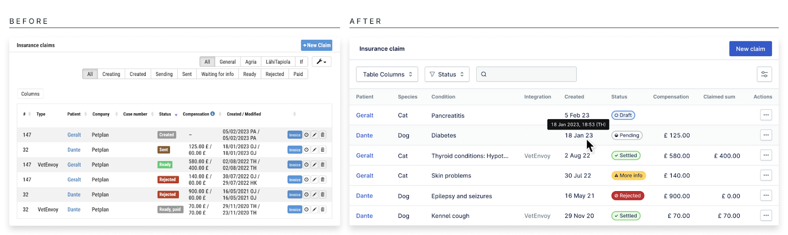
Fig.2 – Sweeping design changes will result in more intuitive, readable, and useful interfaces throughout Provet Cloud.
With veterinary professionals as our guide
Of course, design is only one aspect of creating a great user experience. We’ve made it a priority to listen to our users and gather feedback on how we can improve the software to better meet your needs, investing heavily in user experience and product research in order to chart the path of meaningful improvements.
Our research team has been working very closely with veterinary professionals inside and outside of our company to ensure that we have the clearest possible understanding of the challenges you face in your day-to-day work. We, in turn, use that knowledge and data as a foundation to ensure that Provet Cloud solves the most relevant problems – and that it does so in the best possible way.