Starting at the beginning of November we’re bringing the next major update to Provet Cloud’s user interface, introducing a new sidebar to the product and, with it, a new navigation scheme. Additionally, the taskbar – where the clinic switcher, search, notifications, tasks, and the user menu live – will also receive an update.
This update will roll out gradually to all our customers globally, over the span of about two weeks. From 6 November, we’ll deliver this update to approximately half our customers in Europe. We’ll continue the rollout to the other half of European customers on 13 November, alongside with customers in the US and other overseas markets. Enterprise customers will receive this update on separate schedules.
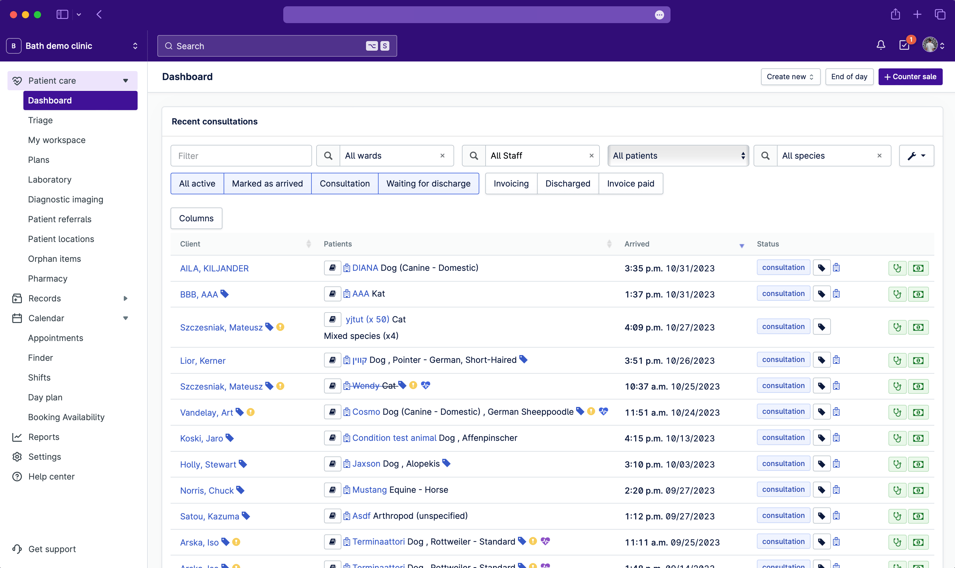
.png?width=3424&height=2124&name=dashboard-1%20(1).png)
Fig. 1. Provet Cloud’s reworked taskbar and sidebar bring cleaner design and faster navigation.
This update follows other changes we’ve made to pieces of the interface in service to increasing legibility, scannability, and making other foundational improvements to the UI as our product teams work to modernize Provet Cloud overall.
One of the chief benefits of the navigation update is how it brings all of the app’s major feature areas to the fore and categorizes them in a more logical and intuitive way, which helps to increase a user’s understanding of the entirety of the system. Navigation also becomes quicker, as the number of clicks to get to any one page are reduced by virtue of everything being immediately visible.
.png?width=1300&height=530&name=Untitled%20(5).png)
Fig. 2. A before-and-after comparison of the outgoing and new navigation and taskbar.
In addition to the navigation, the task bar at the top of the app has received a slight rework as well. The notifications, tasks, and user menu have all received slight updates in this project, ahead of some functionality improvements we're currently working on for each of those items.
.png?width=1504&height=976&name=Untitled%20(6).png)
Fig. 3. A view of the design adjustments brought to notifications, tasks, and user menu in the taskbar.
These changes represent the figurative tip of the iceberg when it comes to the improvements we’re getting ready to bring to Provet Cloud over 2024 and beyond; under the surface, the revised navigation and taskbar are just one piece of a larger re-platforming of the UI’s technical underpinnings.
Over the course of the coming year, we’ll continue to make improvements to how pages in Provet Cloud are categorized and where in the navigation they live. For example, over the long-term we’ll be bringing stock features out of settings and into their own top-level section in the navigation. We’ll also group finance-related features together more explicitly into a “billing” section.